
DB Schenker Connect
DB Schenker needed to move its B2B booking process from slow phone calls and emails to an easy online self-service platform. By finding bottlenecks in their old system and mapping out new user flows for Ocean, Air, and Land freight, I redesigned the entire booking experience. I turned long, confusing forms into a fast, smooth flow using our corporate design system—directly fixing the major drop-off points we found during user testing.


My Role: Lead UX/UI Designer
Platforms: Desktop and Mobile Web
Key Results: converted 48% of phone and email bookings to self-service digital channels; reduced booking steps by two-thirds.
What is DB Schenker Connect?
DB Schenker Connect is an online service where business customers can get instant price quotes, book shipping for their cargo (by sea, air, or land), and track their shipments 24/7.
The Problem
Customers preferred to book shipments the old-fashioned way: by calling or emailing customer support. Existing digital booking tools were confusing, overly complex, and visually inconsistent.
Key Objectives
Harmonize Ecosystems: Merge fragmented DB Schenker services into a single platform aligned with the latest corporate design system.
Customer-Centric Architecture: Redesign the user experience to make instant self-service quotes and bookings intuitive.
Increase Online Bookings: Get customers to book online instead of calling or sending emails.
Learning What Users Needed
To understand why people avoided the old online tools, we watched real logistics managers do their jobs (shadowing) and collected feedback directly from the website (user surveys).
We discovered three main complaints:
1. Hidden Prices: People couldn't see shipping prices early enough in the process.
2. Confusing Screen Layouts: The screens felt crowded and messy.
3. Unclear Options: There were too many complicated choices without clear explanations.

The Main Types of Users (Personas)
We focused on two main customer types - Contracted Customer and Spot Customer.


Simplifying the Booking Steps (User Flow)
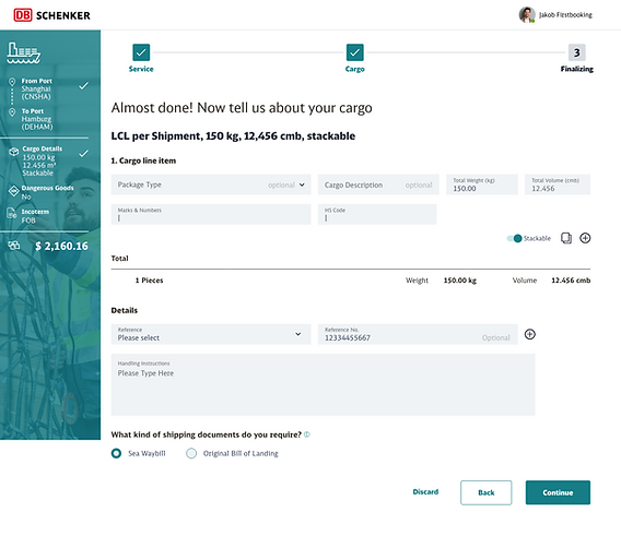
I mapped out every single step a customer takes to book a shipment by sea or air.
By removing unnecessary questions and combining double steps, we cut out two-thirds of the old screens, making the booking process much faster.

User flow diagram and mockup for the "Cargo" page
Designing the Screens
I created early screen designs (wireframes) using DB Schenker’s Design System.
Why We Started with Desktop
While many consumer apps are designed for mobile phones first, logistics managers spend most of their workday using office computers with large screens. We made sure the desktop version worked perfectly first before adapting it for mobile screens.


Dashboard
For customers who book frequently, we built a central Dashboard where they can:
-
Track all their active shipments live on one page.
-
Re-book frequent routes with one click using saved templates.
-
Easily add extra services like customs clearance or insurance.


First implementation of the dashboard with customization option
Guided Onboarding: Helping Users Learn the Dashboard
To ensure new and returning customers didn't feel overwhelmed by the new dashboard, I designed an interactive onboarding tour for their first visit.
Step-by-Step Guided Walkthrough: A simple, dismissible tour that highlights main features - showing users how to navigate the interface, customize widgets, and easily find essential services.


Testing with Real Users
Before building the final website, we tested our prototype with 10 real logistics professionals over video calls.
We gave them two simple tasks:
-
Task 1 (Specific): Complete an end-to-end freight booking.
-
Task 2 (Open-ended): Explore the dashboard and explain its functions out loud.
The result: Most users loved the new layout. However, some solutions were confusing to them, so we fixed those before sending the designs to the software developers.


Usability testing via video call (remote moderated testing)
A/B Testing
To confirm our new design outperformed the legacy booking tool in real-world conditions, we ran an A/B test with a segment of live website traffic before fully rolling out the update.
What We Tested.
Variant A (Legacy Control): The original multi-step booking wizard.
Variant B (New Flow): The redesigned, streamlined booking flow.
What We Measured & Discovered.
Higher Conversion Rate: Variant B saw a 16% increase in completed bookings, proving that reducing steps directly converted more casual browsers into paying customers.
Faster Time-to-Complete: Users finished their bookings nearly 2 minutes faster on Variant B, confirming that clear layouts and visible pricing eliminated hesitation.
Lower Drop-off at Price Selection: Showing transparent shipping rates earlier in the flow reduced user drop-offs on the payment/confirmation screen by 22%.
Making it Work on Mobile Phones
On desktop computers, we used large tables to compare shipping schedules and prices. But big tables don't fit well on small phone screens.
The Solution: On mobile phones, I turned those big tables into neat, easy-to-read cards that stack vertically, making it simple to compare prices on a phone screen.


Final Results & Business Impact
The new DB Schenker Connect launched in January 2022 with huge success:
66% Fewer Screens: Customers complete bookings in one-third of the original steps.
48% Fewer Support Calls: Phone calls and emails dropped by almost half because customers could easily book online themselves.
Higher Online Sales: More customers now prefer using the website over traditional manual channels.
Key Lessons Learned
Watch users in action: Observing people do their daily work reveals problems they forget to mention in interviews.
Test early and fix fast: Testing simple prototypes early saved time and money before code was written.
Ask about goals, not features: Instead of asking users what buttons they want, ask them what job they are trying to finish.